There is a moment in The Devil Wears Prada when fashion-magazine bigwig Miranda Priestly, played by Meryl Streep, tells her fashion-sceptic assistant, played by Anne Hathaway, the meaning of the shade of blue — known as cerulean — on her sweater. Priestly says the shade was first seen a few years earlier in a specific collection on the runway and then it “filtered down” to department store stocks.
Pantone Color Institute is obsessed with colours. Even in a world of Tumblr and Pinterest, when it comes to having a sway with colours, this is the place. The colour for 2024 is Peach Fuzz.
“For 2024, it needed to be a colour whose warm and welcoming embrace conveyed a message of compassion, of empathy. One that is nurturing and presents a cozy sensibility, brings people together and elicits a feeling of tactility. At the same time, it has been refashioned to display a more contemporary ambience, one whose gentle lightness and airy presence lifts us into the future,” says Laurie Pressman, vice-president, Pantone Color Institute, over a video call.
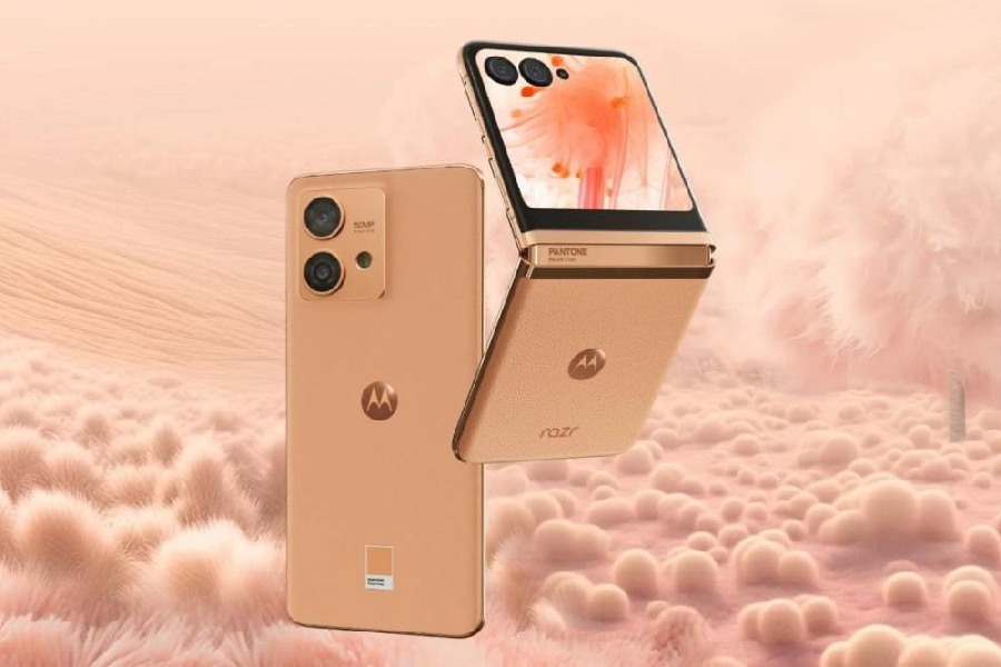
The idea was to talk about why this particular shade of colour has been chosen for Motorola Razr 40 Ultra and Motorola Edge 40 Neo.
“What we really like about Peach Fuzz is that the colour has a lot of meaning behind it and it really aligns beautifully with Motorola’s pillars of being a brand that strives to be inclusive, and also that wants to make technology more accessible to more consumers worldwide. Technology becoming more and more intertwined with humanity and colour, more and more, provides a tool not only for self-expression, but for deeper and more meaningful experiences between consumers and our devices,” says Ruben Castano, global head for customer experience and design, Motorola Mobility.
Not an arbitrary process
Peach Fuzz evokes plenty of images — Palm Springs, innocence, vintage vibe, emotional tonality… it depends on who you are asking. If not anything, it will probably look good on Taylor Swift. The Pantone Colour Institute originally created the Pantone Colour of the Year educational programme in 1999. So this is the programme’s 25th year and it has come a long way since 2000’s cerulean blue.
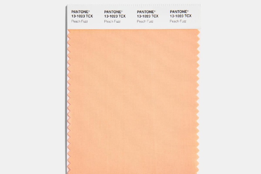
The Pantone sheet for Peach Fuzz. Pantone
“The goal of the programme was then, and is still today, to engage the design community, and colour enthusiasts around the world into a conversation around colour. We wanted to draw attention to the relationship between culture and colour and to highlight to our global audience about what is taking place in culture at any point in time, expressed and reflected through this language of colour. I don’t know if we ever expected when we first began this programme for it to be going this long. But we’re so happy that it is because for those of us who live at Pantone, we all eat, breathe and see our world through this lens of colour,” says Pressman.
For the team involved in the Pantone Colour of the Year, deciding a colour is not an arbitrary decision. It’s a combination of the macro-level colour trend forecasting and research that the global team involved with the Pantone Colour Institute does around the year that informs this selection as well as all of the content and colours that go into our different trend forecasting products to arrive at the selection each year.
“Each year, the global team combs the world, looking for what’s taking place in colour, and what are the new colour influences. This can include anything and everything. This could be fashion, all areas of design, aspirational travel destinations as well as new lifestyles, play styles, enjoyable escapes, socio-economic conditions, so social values play into this as well, influences can also stem from new technologies, materials, textures, and effects that impact colour, relevant social media platforms, and even upcoming sporting events that capture worldwide attention,” says Pressman.
Enriches the mind, body and soul
For a company like Motorola, a lot of thought had to be put into how to implement the colour; it’s a difficult process when manufacturing details are considered. “The idea behind the name of the colour, Peach Fuzz, is almost like the skin of the fruit, and how it has that velvety soft touch feel to it when you hold it in your hand. We are bringing that same emotion into the design of the rear cover of the products. But the nice thing about colour is that we can obviously apply it physically on the device, but the meaning of the colour can also come to life through our software experiences,” says Castano.
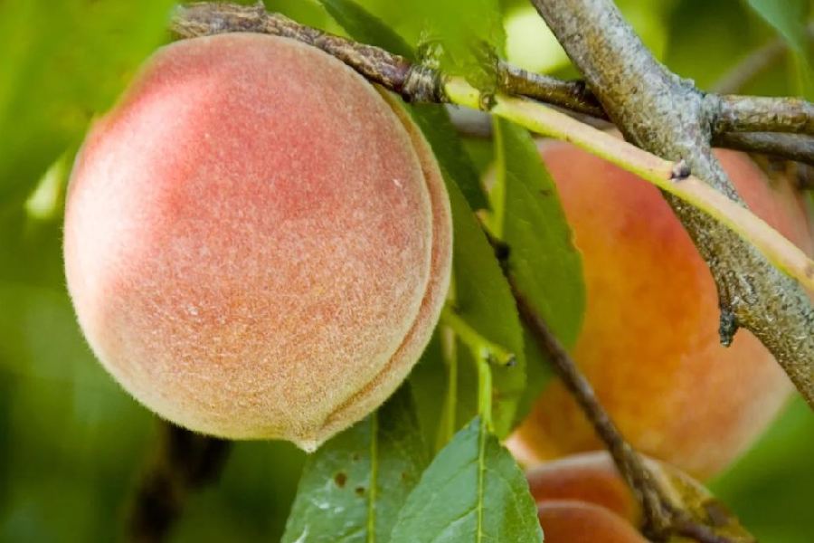
The idea behind the name of the colour, Peach Fuzz, is almost like the skin of the fruit: It has that velvety soft touch feel to it. iStock
Talking about Peach Fuzz, Pressman says that in some years, the colour choice is more of an evolution. “As we enter 2024, one of the things that is top of mind and it’s been top of mind in our trend forecasting books as well… our need for nurturing, our need for empathy and compassion continues to grow stronger, as well as our desire for a more peaceful future. We’ve been reminded that a vital part of living a full life is having good health, stamina and the strength to enjoy it. And in a world which often emphasizes productivity and external achievement, how important it is for us that we recognise the importance of fostering our inner selves and find moments of respite and creativity and human connection amid the hustle and bustle of our modern life. We navigate the present and build towards this new future. We’re reevaluating what’s important; reframing how we want to live, we’ve been expressing ourselves with greater intentionality and consideration, recalibrating our priorities to align better with our internal values,” says Pressman.
Peach Fuzz is a velvety, gentle peach tone, whose all-embracing spirit enriches the mind, body and soul. It’s a subtle, essential shade, bringing a feeling of kindness, of tenderness… communicating a message of caring and sharing, community and collaboration.
“This is an appealing peach hue that’s softly nestled between pink and orange. You can see this tactility. When we selected this colour, you can imagine the tactility to this colour. It’s a colour that crosses into all areas. It’s a colour that brings belonging, inspires calibration and an opportunity for nurturing, conjuring up an air of calm, offering us a space to be, to heal and to flourish,” says Pressman.
Pantone Colour of the Year since 2000
- 2024: Peach Fuzz
- 2023: Viva Magenta
- 2022: Very Peri
- 2021: Pantone 17-5104 Ultimate Gray + Pantone 13-0647 Illuminating
- 2020: Classic Blue
- 2019: Living Coral
- 2018: Ultra Violet
- 2017: Greenery
- 2016: Rose Quartz and Serenity
- 2015: Marsala
- 2014: Radiant Orchid
- 2013: Emerald
- 2012: Tangerine Tango
- 2011: Honeysuckle
- 2010: Turquoise
- 2009: Mimosa
- 2008: Blue Iris
- 2007: Chili Pepper
- 2006: Sand Dollar
- 2005: Blue Turquoise
- 2004: Tigerlily
- 2003: Aqua Sky
- 2002: True Red
- 2001: Fuchsia Rose
- 2000: Cerulean