I recently had the privilege of attending the setting up of a plaque in honour of an artist known for a distinctively vibrant and colourful style and for being dear to the city. The text was a reminder, in brief, of the artist’s career and its landmarks. The language was respectable, not verbose, which can often be the feature of plaque-language, yet the words were laden with a certain gravitas. But so far, it was only an ordinary plaque.
What really made it stand out was the lettering. It was extraordinarily ugly even by plaque standards. The most important plaques will often not have a Times New Roman or a Garamond or a Helvetica, or any font commonly used for a common purpose, considering them merely frivolous. Instead they will choose a severe font which was possibly specially invented for plaques for its ugliness. The lettering on this plaque was so powerfully ugly that it seemed capable of crushing every drop of beauty and life out from the artist’s works. The layout supported the lettering: the words seemed to have been carelessly thrown at us, appearing sometimes on top of one another, sometimes far apart, creating a sense of chaos and completely defeating the idea of design.
No one objected. The plaque was perfect. It was authority: pronouncements of authority in our country are considered articulated best when they successfully express a contempt for beauty, or levitas in any form, which beauty obviously is in this scheme of things. It is an utterly dispensable thing, for it dilutes high seriousness. (Laughter would demolish it.) Anything serious, which authority is, should be sombre, untouched by beauty and humour, preferably with a bleak outlook, perhaps even painful, frightening and full of itself.
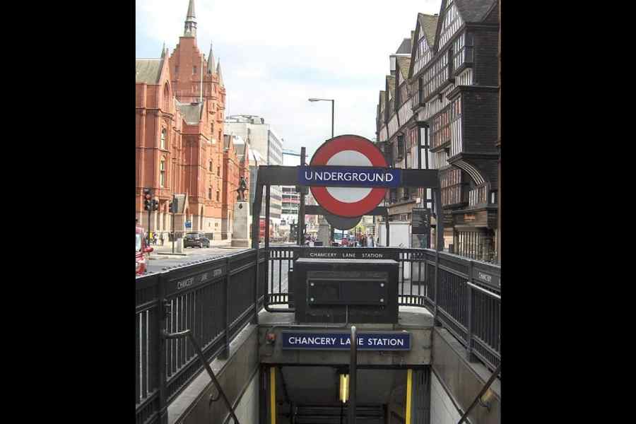
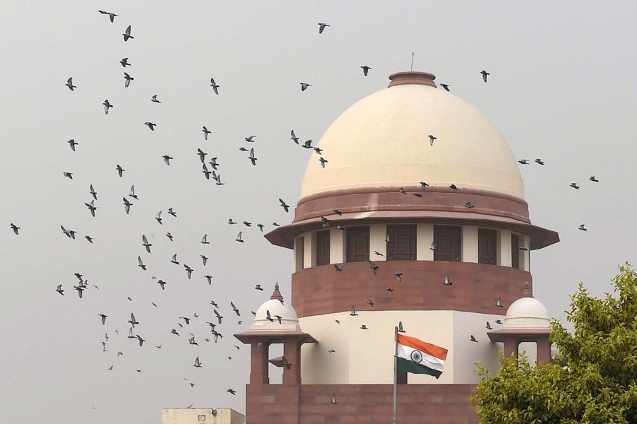
The best plaques have these features. All successful official announcements do, too, and most spectacularly, government buildings. The more recent they are, the uglier. In few places in the world do you get a larger collection of eyesores than in India. West Bengal must receive a special mention in this context. Some of the official buildings here may make you want to cry. Burst into tears, really. And tremble in fear.
They embody the very spirit of bureaucracy. It is the same spirit that requires you to still bow down to statements such as: “The situation will be reviewed in due time and action thereof will be notified accordingly.” Can you stand up to ‘thereof’? Would you ever dare to laugh at it? Would you call it pretty?
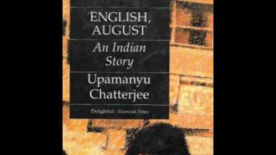
Dullness commands a special respect in the nation. Upamanyu Chatterjee spotted it and pinned it down wonderfully long ago in his novel, English, August: An Indian Story, where a young IAS officer in the fictional small town, Madna, is being swallowed by dullness. He is disappointing in the discharge of his duties because he is not capable of appropriate dullness, among other things. With some satisfaction he turns around a phrase from Dryden in his head: “lambent dullness”.
Let me try my hand at authority, too. ‘Whence’, I repeat, ‘whence’, does this particular dullness derive its power? A learned person tells me it is directly from Thomas Babington Macaulay’s 1835 Minute on English education for Indians. “We must at present do our best to form a class who may be interpreters between us and the millions whom we govern; a class of persons, Indian in blood and colour, but English in taste, in opinions, in morals, and in intellect.” As soon as he said these words, an ugly spirit descended from the text, invaded our ‘native’ souls and turned us into ‘writers’, with a huge building devoted to the new species. We were never ourselves again. It would also eventually lead to our partiality towards certain fonts.