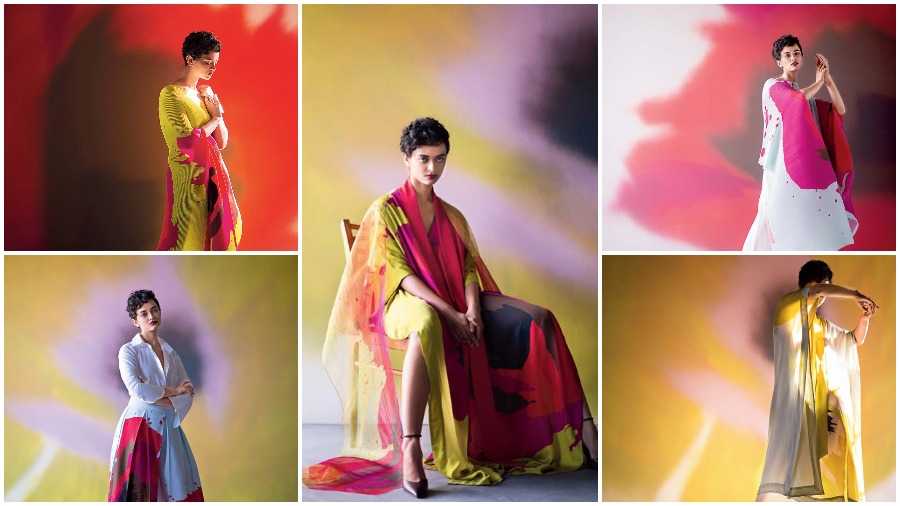
If you have been following Mumbai-based artist-designer Payal Khandwala’s works, you know that recently, her Instagram page (@payalkhandwala) was blacked out to introduce her new branding shortly after. “To give a bad analogy, an ex-boyfriend can’t co-exist with your present because you grow and evolve into another story and that is what happened with our brand. I felt like the brand needed a new look to go with our designs,” said Payal when we caught up with her. Since then, she is taking it “slow” with shorter edits in the form of “releases” instead of collection launches. On the heels of her Release 4 — a canvas inspired by poppies on diaphanous fabrics and easy silhouettes, we chatted with Payal. Excerpts:
So what led to 2020 becoming the year for you to give your brand a new look and feel?
Might sound like a cliche but it became a year for us to get off the hamster’s wheel and to pause and reset. I know a lot of people were doing the same and trying to figure out how to make the clothes more sustainable — though we were doing that anyway. Our product line and the philosophy with which we work really did not need much pivoting because we were in any case aligned in these things, pre-Covid. But one of the things that we always thought about but never addressed was how to look at branding in a more holistic way. The whole label was started on such a whim that I never really had the time to think about things like what the font would be that would echo the house aesthetics and just picked one that was good enough. The whole thing happened so fast that I had two months to make the clothes, labels, bags and letterheads. So as the brand grew and became what it did, I don’t think it aligned with me and grew apart somewhere. It is not that I did not like it but I always felt that there was other stuff out there that was better suited to the brand. I felt that everything needed to be resolved in a way so that everything reconciled better. For example, the brand and its clothes felt very dramatic and structured but the font was very light compared to that. So I felt the font had to be stronger like the clothes and minimal with that versatility like the clothes have. So I thought it would be a nice exercise to see what the brand stands for after all these years and try to work around it.
What led you to take to these releases instead of complete collections?
Instead of two giant collections in a year, we are doing these slow releases because everyone is shopping different now and their expectations are different. We are not designed to be Zara and we don’t design like them either so it is impossible for us to have new things every two weeks. So this was our way to combat that. When people are shopping online, I am putting out these slow releases and this felt like the best strategy. It also relieves some of the pressure on us, considering the challenging situation now. It still has its challenges but it is easier to do it this way.
In terms of designing these releases — how do you go about them? The latest release is inspired by poppies. What inspired that?
For the last one, I felt the need of being hopeful because everything around was so morose and hopeless with all the bad news we were constantly reading. I wanted to give a nod to the people who were trying their best to live with hope and create a space for them amidst the hopelessness. In terms of the graphics, the poppy is such a graphic and overtly obvious shape to go with. For me, the poppy also represents different things for different cultures — remembrance, loss, recovery and forgiveness. So it felt like a good starting point. Then we did what we do best with it — colour-block it and make it bright, big and bold. When I visualised it, I checked what all we could do with it to see how far we could take this one release. So we wanted to use fabrics that are more diaphanous and transparent like organzas and linen. I wanted to keep it easy because I don’t know if people were going out but since it is an online model, there might be some parts of the world that are not in lockdown. There is no fixed number for these releases and it is so frustrating to stick to the grid of Instagram. I always feel that if one idea can go to 15 places then it will be 15 garments but if it lends itself to 35, then I will do that. I don’t push anything — it is what it is.
So how has the reception been to the new language of the brand?
If we go by the sales, then the reception has been good. For me it’s always a bit of a challenge because if we have to go by the online model, then things have to be done a certain way. I can be supremely creative but it is of no use if people can’t understand what is happening or cannot see the back of a garment. So I have to be quite basic about communicating that to the buyers so that it is easy for them to purchase it online. That restricts me quite a lot with the mood I am trying to create with what I had in mind and the actual release. When I shoot, I have the freedom to be creative and to play with the imagery. I might like the sleeve to look like a flower and to see the colours meld but a buyer wants to know where the maxi ends or the fact that they really can’t tell if it is a pant or a skirt. This is something I have had to make peace with and I am trying to toe this balance. I love creating art but it’s a product at the end of the day.